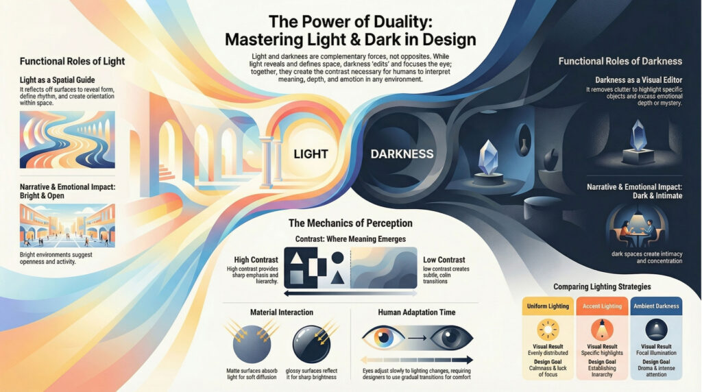
Light and dark form one of the most fundamental dualities in human perception. Between these two extremes lies an entire spectrum through which we experience space, form, emotion, and meaning. In design—especially in architecture, visual communication, and CGI—understanding this relationship is not optional; it is foundational.
At its core, light is not just a physical phenomenon but a medium of communication. It reveals, guides, emphasizes, and sometimes conceals. Darkness, on the other hand, is not merely the absence of light—it is equally powerful, shaping perception through contrast, mystery, and focus. Together, they create a dynamic system through which humans interpret their surroundings.
Light as a Medium of Perception
Human beings perceive the world primarily through light. Whether it is direct sunlight or diffused illumination, our visual system depends on light reflecting off surfaces to construct meaning. However, perception is not absolute—it is relative.
Brightness is never experienced in isolation. A surface appears bright or dark depending on its context, surrounding contrast, and adaptation of the eye. This is why the same object can look dramatically different under varying lighting conditions.
Light also defines spatial understanding. In architecture, daylight entering through openings creates orientation, depth, and rhythm. As light penetrates deeper into a space, its intensity reduces, requiring artificial lighting to maintain visual continuity. Thus, design becomes a balance between natural and artificial illumination.
The Role of Darkness
Darkness is often misunderstood as a limitation, but in reality, it is a design tool. While light reveals, darkness edits.
In low-light environments, selective illumination becomes more powerful. A single lit object in a dark space attracts attention far more effectively than the same object in a uniformly bright environment. This principle is widely used in exhibitions, retail, and storytelling visuals.
Darkness also creates emotional depth. It introduces calmness, intimacy, and sometimes tension. In contrast to the clarity of bright spaces, dark environments evoke curiosity and focus, guiding the viewer’s attention intentionally.
Contrast: Where Meaning Emerges
The interaction between light and dark produces contrast, which is essential for visual clarity and hierarchy.
High contrast creates sharp distinctions, making elements stand out clearly. This is useful for emphasis and readability. Low contrast, on the other hand, produces subtle transitions, often associated with calmness and continuity.
Designers manipulate contrast to control perception: Bright backgrounds reduce visibility of light objects but enhance dark ones Dark backgrounds make illuminated objects more prominent Gradients of light guide the eye through space.
Without contrast, visual information becomes flat and difficult to interpret.
Surface, Material, and Reflection
Light does not act alone—it interacts with materials. The same light behaves differently on matte, glossy, textured, or reflective surfaces.
Matte surfaces absorb light, producing soft and diffused reflections. Glossy surfaces reflect light sharply, increasing brightness and contrast. Textured surfaces create variation, enhancing depth perception.
This interaction determines how we perceive form and materiality. For instance, reflective surfaces can appear brighter than they actually are, while dark matte surfaces can suppress visual detail. Thus, material selection in design is as much about light behavior as it is about aesthetics.
Human Eye and Adaptation
The human eye is highly adaptive. It constantly adjusts to varying levels of brightness, but this adaptation is not instantaneous.
When moving from bright to dark environments, the eye takes time to adjust, during which visibility is reduced. Conversely, transitioning from dark to bright spaces causes temporary discomfort due to sudden exposure.
This has direct implications in design:
- Gradual transitions improve comfort
- Sudden contrasts can be used for dramatic effect
- Lighting levels must align with human visual capability
Additionally, the eye perceives brightness differently under different conditions:
- Rod cells function in low light (monochromatic vision)
- Cone cells function in bright light (color perception)
Lighting as Information
Light is not just for visibility—it communicates information.
Through lighting, designers can:
- Define spatial hierarchy
- Highlight focal points
- Guide movement and navigation
- Create mood and narrative
In architectural and visual design, lighting transforms from a technical requirement into a storytelling tool. A well-lit space is not just visible—it is readable.
Lighting Concepts in Practice
Different lighting strategies produce different spatial experiences: Uniform lighting creates a calm and evenly distributed environment but may lack focus Accent lighting highlights specific elements, creating hierarchy Directional lighting introduces shadows, enhancing depth and form Ambient darkness with focal light creates drama and attention For example, a bright room suggests openness and activity, while a dimly lit space with focused illumination creates intimacy and concentration.
Measuring Light: From Physics to Perception
While perception is subjective, lighting can be measured objectively through units such as:
- Illuminance (lux): amount of light falling on a surface
- Luminance (cd/m²): perceived brightness of a surface
However, these measurements do not fully define human experience. Two environments with identical illuminance can feel completely different due to contrast, material, and context. This highlights an important principle:Lighting design is not just about numbers—it is about perception.
Technology and Possibility
Advancements in lighting technology, especially LEDs, have expanded the possibilities of design. Designers now have precise control over intensity, color, direction, and distribution. Yet, regardless of technological progress, the fundamental challenge remains the same:balancing light and dark to create meaningful visual experiences.
Conclusion: Designing Between Two Extremes
Light and dark are not opposites in conflict—they are complementary forces in design. Every visual experience exists somewhere between these two poles. Good design does not maximize light or eliminate darkness. Instead, it carefully orchestrates both to create clarity, emotion, and focus. Ultimately, mastering light and dark means understanding how humans see, feel, and interpret the world. It is not just about illumination—it is about perception, communication, and meaning.
